import numpy as np
import matplotlib.pyplot as plt
from sklearn.neighbors import KNeighborsRegressor
from sklearn.linear_model import LinearRegression
from sklearn.metrics import mean_squared_error
from sklearn.model_selection import train_test_splitCS 307: Week 02
Setup
To begin, we’ll import numpy and matplotlib, as well as a few models and functions from sklearn.
Data Generation
To begin to investigate two regression methods, we’ll first need some data.
np.random.seed(42)
n = 200
X = np.random.uniform(low=-2*np.pi, high=2*np.pi, size=(n,1))
y = np.sin(X) + np.random.normal(loc=0, scale=0.25, size=(n,1))
X.shape, y.shape # verify shapes of the data((200, 1), (200, 1))We’ll create two visualizations:
- The left hand side is the data, with the true “signal” represented by the black curve.
- The right hand side is just the data.
Importantly, when simulating data, we know the true signal, but we need to be clear that in practice that is not the case. In practice, we’ll be on the right hand side. In some sense the goal is to learn the black curve on the left hand side using only information from the right hand side.
# setup figure
fig, (ax1, ax2) = plt.subplots(1, 2)
fig.set_size_inches(10, 5)
fig.set_dpi(100)

# add overall title
fig.suptitle('Simulated Sine Wave Data')

# x values to make predictions at for plotting purposes
x_plot = np.linspace(-2*np.pi, 2*np.pi, 1000).reshape((1000, 1))

# create subplot for "simulation study"
ax1.set_title("Simulation Study")
ax1.scatter(X, y, color="dodgerblue")
ax1.set_xlabel("x")
ax1.set_ylabel("y")
ax1.grid(True, linestyle='--', color='lightgrey')
# add true regression function, the "signal" that we want to learn
ax1.plot(x_plot, np.sin(x_plot), color='black')

# create subplot for "reality"
ax2.set_title("Reality")
ax2.scatter(X, y, color="dodgerblue")
ax2.set_xlabel("x")
ax2.set_ylabel("y")
ax2.grid(True, linestyle='--', color='lightgrey')

# show plot
plt.show()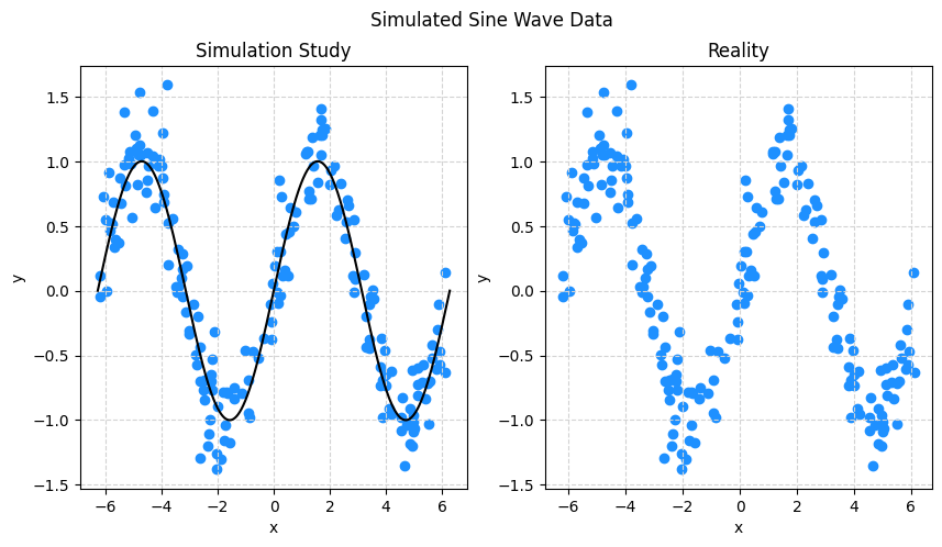
k-Nearest Neighbors and Linear Regression
The KNeighborsRegressor() and LinearRegression() functions can be used to define a model. Because these are both part of the sklearn package, they share the same interface. Generally, there will be three things we need to do:
- Define the model
- Fit the model to data
- Make predictions on new data
First, we’ll define three different KNN models, one with \(k = 1\), another with \(k = 10\), and lastly one with \(k = 100\). We’ll give them names to keep track of which is which.
knn001 = KNeighborsRegressor(n_neighbors=1)
knn010 = KNeighborsRegressor(n_neighbors=10)
knn100 = KNeighborsRegressor(n_neighbors=100)
Similarly, we’ll define a linear model.
lm = LinearRegression()Fitting Models
To fit a model to data with sklearn you will use the .fit() method from the model model you already created. The fit functions will for the most part need to inputs:
X: a matrix like object storing the feature variables as columnsy: an array like object storing the response as a single column
knn001.fit(X, y)
knn010.fit(X, y)
knn100.fit(X, y)
lm.fit(X, y)LinearRegression()In a Jupyter environment, please rerun this cell to show the HTML representation or trust the notebook.
On GitHub, the HTML representation is unable to render, please try loading this page with nbviewer.org.
LinearRegression()
Simple enough!
You might notice a little box that says LinearRegression() if you are working in a Jupyter notebook. For now you can simply ignore this, as it really isn’t telling us much. Later, we’ll see more information in this box as we develop what sklearn calls pipelines.
Making Predictions
To make predictions with a model that you have fit, we will use the .predict() method for the model in question. Whereas the .fit() method needs both an X and a y, the .predict() method of course does not, since the whole point is to make a prediction for an input X, thus it takes a single input, X.
Here, we limit ourselves to the first 10 predictions, just for display purposes.
knn001.predict(X)[1:10]array([[-0.52243632],
[ 0.29761307],
[ 0.76712437],
[ 1.39143185],
[ 1.04356159],
[ 0.36896939],
[-0.82972028],
[ 0.71162244],
[ 0.69960621]])Again, the interface is the same for both KNN and linear models, but of course, they make different predictions based on the same input.
lm.predict(X)[1:10]array([[-0.47481622],
[-0.24126368],
[-0.0988863 ],
[ 0.37377045],
[ 0.37379621],
[ 0.47834678],
[-0.38454524],
[-0.10150941],
[-0.21572013]])To get a better idea of what these predictions actually look like, lets plot them.
# setup figure
fig, (ax1, ax2) = plt.subplots(1, 2)
fig.set_size_inches(10, 5)
fig.set_dpi(100)

# add overall title
fig.suptitle('Simulated Sine Wave Data')

# x values to make predictions at for plotting purposes
x_plot = np.linspace(-2*np.pi, 2*np.pi, 1000).reshape((1000, 1))

# create subplot for KNN
ax1.set_title("k-Nearest Neighbors")
ax1.scatter(X, y, color="dodgerblue")
ax1.set_xlabel("x")
ax1.set_ylabel("y")
ax1.grid(True, linestyle='--', color='lightgrey')
ax1.plot(x_plot, knn001.predict(x_plot), color='pink', label='k = 1')
ax1.plot(x_plot, knn010.predict(x_plot), color='black', label='k = 10')
ax1.plot(x_plot, knn100.predict(x_plot), color='limegreen', label='k = 100')
ax1.legend()

# create subplot for linear model
ax2.set_title("Linear Model")
ax2.scatter(X, y, color="dodgerblue")
ax2.set_xlabel("x")
ax2.set_ylabel("y")
ax2.grid(True, linestyle='--', color='lightgrey')
ax2.plot(x_plot, lm.predict(x_plot), color='limegreen')

# show plot
plt.show()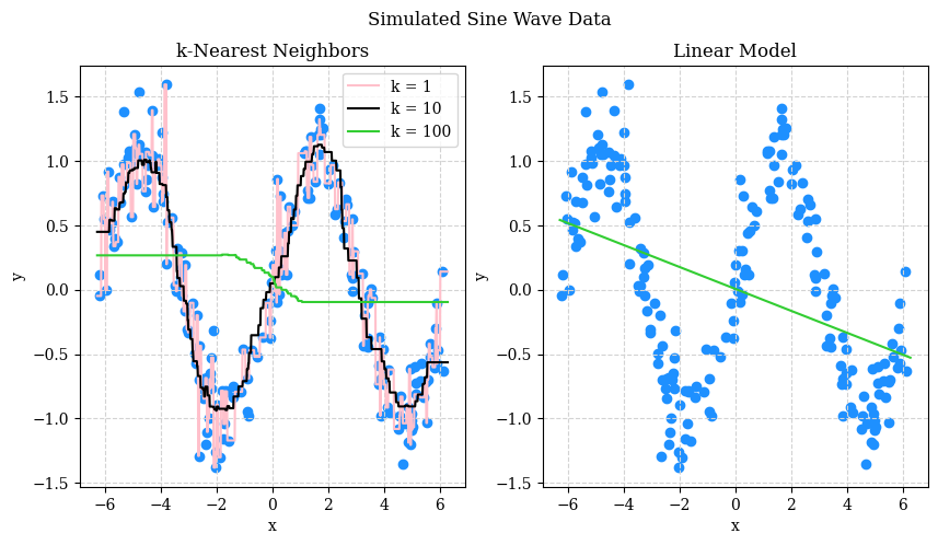
What do we see? Perhaps not the prettiest plot, but:
- With \(k = 1\) we see that the predicted “curve” goes through all the data points.
- With \(k = 100\) we see that the predicted “curve” is no where near most of the data.
- With \(k = 10\) we see a predicted “curve” that is… very close to a sine wave!
The linear model, predictable, does not work well here. But that isn’t to say that a certain linear model couldn’t work well here…
OK, so based on this graphic, we probably like the model with \(k = 10\). However, in practice:
- We will likely have much noisier data.
- We will likely have many more features.
What does that mean? Well, in short, that we probably will not be able to select a model based on a graphic like these.
So what do we do? We use a metric that summarize how well the models are making predictions. Let’s focus on KNN for a bit. The metric we’ll introduce now is root mean square error or RMSE. For the purpose of selecting a model, RMSE will select the same model as MSE, mean square error, but RMSE has the advantage of having the same units as the response.
\[ \text{RMSE}(f, \mathcal{D}) = \sqrt{ \frac{1}{n_\mathcal{D}} \sum_{i \in \mathcal{D}} \left( y_i - f(x_i) \right) ^ 2} \]
Here:
- \(f\) is a function that outputs predictions. So, think the output of
some_model.predict(). - \(\mathcal{D}\) is a dataset. For now, we’re dealing with a complete dataset, but in a moment we will be splitting the data, and we’ll be calculating different metrics based on different input data.
- \(n_\mathcal{D}\) is the number of observations in the dataset \(\mathcal{D}\).
- \(i\) is the index of an observation (row) of the dataset \(\mathcal{D}\). \(x_i\) is the feature value(s) for this observation and \(y_i\) is the target value.
Any time you see a sum, \(\sum\), you will naturally think “perform this calculation for each \(i\), then sum the results”. This sounds like a job for a for loop, and you could do that, however due to the vectorized nature of nupmy we can skip the look and just operate directly on an array
print(np.sqrt(np.mean((knn001.predict(X) - y) ** 2)))
print(np.sqrt(np.mean((knn010.predict(X) - y) ** 2)))
print(np.sqrt(np.mean((knn100.predict(X) - y) ** 2)))
0.0
0.23366221486551458
0.764849529471475Here we’ve calculated the RMSE for each of the three KNN models that we fit on the full data. There are some issues:
- Notice how repetitive that code is?
- The model with \(k = 1\) has the lowest RMSE, but we can already tell this isn’t the “best” of the three models.
First, any time you find yourself repeating code, it is time to write a function!
def rmse(actual, predicted):
return np.sqrt(np.mean((actual - predicted) ** 2))np.random.seed(1)
print(rmse(y, knn001.predict(X)))
print(rmse(y, knn010.predict(X)))
print(rmse(y, knn100.predict(X)))0.0
0.23366221486551458
0.764849529471475This is slightly better! But there are still some issues:
- We still haven’t dealt with \(k = 1\).
- There is still repetition, just less code. We’ll actually decide we’re OK with this for now, but later will let
sklearnhelp automate away this repetition for us.
Now, let’s tackle the \(k = 1\) issue. So, the whole point of regression is to create models that predict well on new (unseen) data. That is, we should evaluate our models with data that was not used to fit the models.
In practice, obtaining “new” data can be difficult or even impossible. But with a computer, and a psuedo-random number generator, data is essentially free! So let’s make some more. Notice that this time we are using a different seed value. As a result, the data will still be generated with the same “signal” but the \(x\) values and the noise will be different.
np.random.seed(307)
X_new = np.random.uniform(low=-2*np.pi, high=2*np.pi, size=(n,1))
y_new = np.sin(X_new) + np.random.normal(loc=0, scale=0.25, size=(n,1))print(rmse(y_new, knn001.predict(X_new)))
print(rmse(y_new, knn010.predict(X_new)))
print(rmse(y_new, knn100.predict(X_new)))0.31901797461082154
0.26182730484843614
0.7196057652675155Interesting! Notice how now the model with \(k = 10\) performs “best” in the sense that it makes the fewest (squared) errors on average. Now the metric aligns with our intuition!
Writing our own RMSE function was fun, but in practice, we’ll use the mean_squared_error function from sklearn. While here we see that it produces the same result, after apply a square root, it is likely a better implementation that will handle edge cases that we haven’t thrown at our function.
np.sqrt(mean_squared_error(y_new, knn010.predict(X_new)))0.26182730484843614OK… that’s great, but in practice, we won’t have the ability to magically make new data appear. So what do we do? We mimic this process with the data we have.
Before we go further, an important note: Many students have likely seen some amount of machine learning. (But if you haven’t, that is more than OK!) If you have, until we introduce the concept, please pretend that you have never heard of or seen cross-validation.
To mimic the above process, we will split our data into two datasets.
X_train, X_test, y_train, y_test = train_test_split(
    X, y, test_size=0.20, random_state=42
)
Here, we’ve used the train_test_split() function from sklearn. We input both our X, and y data, but also supplied a test_size of 0.20 and a random_state of 42. The random state controls the randomness of the splitting, and the test_size controls how much of the data is including in the test set. So what we are doing here is randomly selecting 80% of the rows to be part of what we will call the train dataset, and the remaining 20% will be part of what is called the test dataset.
WARNING! WARNING! WARNING! Do not ever, for any reason, fit a model to test data! (OK, there is technically at times a reason you might do so, but we aren’t going to, so for the purposes of CS 307, never do it!)
We apply the split to both the X and y data, thus the function actually returns four things:
X_train: the feature variables for the train datasetX_test: the feature variables for the test datasety_train: the target variable for the train datasety_test: the target variable for the test dataset
X_train.shape, X_test.shape((160, 1), (40, 1))Based on the percentages we chose (which we will always use unless we specify otherwise) the shape of the train and test sets seem correct.
Now for the annoying step, we’re going to split again! This time we are going to take the train dataset that we just created, and split it into two datasets that we will call validation-train (_vtrain) and validation (_val).
X_vtrain, X_val, y_vtrain, y_val = train_test_split(
    X_train, y_train, test_size=0.20, random_state=42
)
Before we say why, I’ll be honest, I made up the name validation-train. You likely won’t see this elsewhere. Instead, you’ll just see it called the train dataset. I find this confusing, because then there are two train datasets! So, this is my best solution, but you should be aware that I made up this name.
X_vtrain.shape, X_val.shape((128, 1), (32, 1))We’re actually going to skip the “why” of the double split for now. That’s a topic for later on we when talk more holistically about model selection. For now, we’ll elaborate on how to use them as a part of a “model tuning” procedure. That is, given the three values of \(k\) we are considering, how to select from them, and how do we report how well our selected model is performing?
The general procedure is:
- Test-train split the full data.
- Further split the train data into validation-train and validation datasets.
- Fit all candidate models (in this case the three KNN models) to the validation-train dataset.
- With the validation data, calculate the RMSE for predictions from these models. We’ll call this particular value the validation RMSE.
- Select the model with the lowest validation RMSE.
- Fit the selected model to the full train dataset.
- With the test data, calculate the RMSE for predictions from the mode fit to the full train data. We will call this value the test RMSE, which we will report as a final metric of how our chosen model performs on new data.
So,
- Validation RMSE is for selecting models.
- Test RMSE is for reporting the performance of a selected model.
This procedure and explanation are somewhat oversimplified. We’ll add the wrinkles later, but for now, and into the future, this will be the general procedure.
We’ already done steps 1 and 2, so let’s now fit the three models to the validation-train data.
knn001.fit(X_vtrain, y_vtrain)
knn010.fit(X_vtrain, y_vtrain)
knn100.fit(X_vtrain, y_vtrain)KNeighborsRegressor(n_neighbors=100)In a Jupyter environment, please rerun this cell to show the HTML representation or trust the notebook.
On GitHub, the HTML representation is unable to render, please try loading this page with nbviewer.org.
KNeighborsRegressor(n_neighbors=100)
Next, we’ll calculate the validation RMSE for each.
print(np.sqrt(mean_squared_error(y_val, knn001.predict(X_val))))
print(np.sqrt(mean_squared_error(y_val, knn010.predict(X_val))))
print(np.sqrt(mean_squared_error(y_val, knn100.predict(X_val))))
0.3279636107055588
0.24230224459351157
0.682208033130319Here we see that (as expected) the model with \(k = 10\) performs best, so we will “select” this model.
Now that we’ve selected \(k = 10\), we fit this model to the full train dataset.
knn001.fit(X_train, y_train)KNeighborsRegressor(n_neighbors=1)In a Jupyter environment, please rerun this cell to show the HTML representation or trust the notebook.
On GitHub, the HTML representation is unable to render, please try loading this page with nbviewer.org.
KNeighborsRegressor(n_neighbors=1)
And now finally, we report the test RMSE.
y_test_pred = knn001.predict(X_test)
print(np.sqrt(mean_squared_error(y_test, y_test_pred)))0.2892295451737281WARNING! Summarizing a model’s performance with a single value is a dangerous game. First and foremost, realize that a single value devoid of context is absolutely meaningless. An RMSE of 0.000000001 could be terrible while an RMSE for 8000000 could be excellent. It depends on what you are trying to predict! Here since we’re modeling simulated data, we can’t actually really comment on the practical application of this model. We will note that the test RMSE is somewhat close to the standard deviation of the noise we generated, 0.25. Interesting…
In addition to test RMSE, it may be useful to plot a Predicted versus Actual plot, in this case, with the test data. We’ll also include the test data with the chosen model’s predictions.
# setup figure
fig, (ax1, ax2) = plt.subplots(1, 2)
fig.set_size_inches(10, 5)
fig.set_dpi(100)

# add overall title
fig.suptitle('Simulated Sine Wave Data')

# x values to make predictions at for plotting purposes
x_plot = np.linspace(-2*np.pi, 2*np.pi, 1000).reshape((1000, 1))

# create subplot for KNN
ax1.set_title("Test Data, Fitted Model")
ax1.scatter(X, y, color="dodgerblue")
ax1.set_xlabel("x")
ax1.set_ylabel("y")
ax1.grid(True, linestyle='--', color='lightgrey')
ax1.plot(x_plot, knn010.predict(x_plot), color='black', label='k = 10')
ax1.legend()

# create subplot for linear model
ax2.set_title("Test Data, Predicted versus Actual")
ax2.scatter(y_test, y_test_pred, color="dodgerblue")
ax2.set_xlabel("x")
ax2.set_ylabel("y")
ax2.grid(True, linestyle='--', color='lightgrey')
ax2.axline((0, 0), slope=1, color="black")

# shot plot
plt.show()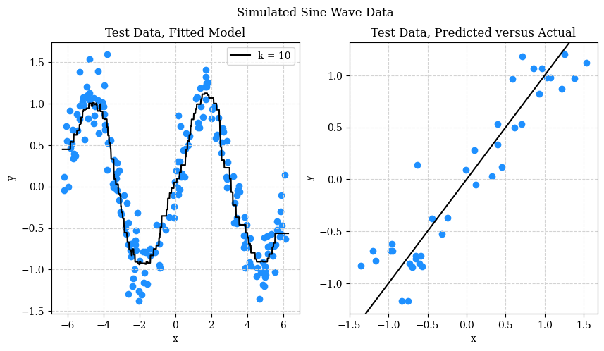
The left hand side should be no surprise at this point. On the right hand side, the predicted versus actual plot, looks good. What are we looking for though? Patterns or individual points that are far from the line. A pattern would suggest that we haven’t fully capture the signal. A single point far from the line indicates that we might occasionally make “big” errors. The test RMSE might obscure this information, but in practice, a single “big” error could be devastating.
What’s Next
This set of notes might have raised more questions than it answered. Good! That means you’re curious and that we have much to learn still. In the next notes we will:
- Introduce another model called decision trees.
- Discuss overfitting and the bias-variance tradeoff.