import numpy as np
import matplotlib.pyplot as plt
from sklearn.tree import DecisionTreeRegressor
from sklearn.neighbors import KNeighborsRegressorCS 307: Week 04
n = 200
X = np.random.uniform(low=-2*np.pi, high=2*np.pi, size=(n,1))
y = np.sin(X) + np.random.normal(loc=0, scale=0.25, size=(n,1))
# setup figure
fig, (ax1, ax2) = plt.subplots(1, 2)
fig.set_size_inches(10, 5)
fig.set_dpi(100)
# add overall title
fig.suptitle('Simulated Sine Wave Data')
# x values to make predictions at for plotting purposes
x_plot = np.linspace(-2*np.pi, 2*np.pi, 1000).reshape((1000, 1))
# create subplot for "simulation study"
ax1.set_title("Simulation Study")
ax1.scatter(X, y, color="dodgerblue")
ax1.set_xlabel("x")
ax1.set_ylabel("y")
ax1.grid(True, linestyle='--', color='lightgrey')
# add true regression function, the "signal" that we want to learn
ax1.plot(x_plot, np.sin(x_plot), color='black')
# create subplot for "reality"
ax2.set_title("Reality")
ax2.scatter(X, y, color="dodgerblue")
ax2.set_xlabel("x")
ax2.set_ylabel("y")
ax2.grid(True, linestyle='--', color='lightgrey')
# show plot
plt.show()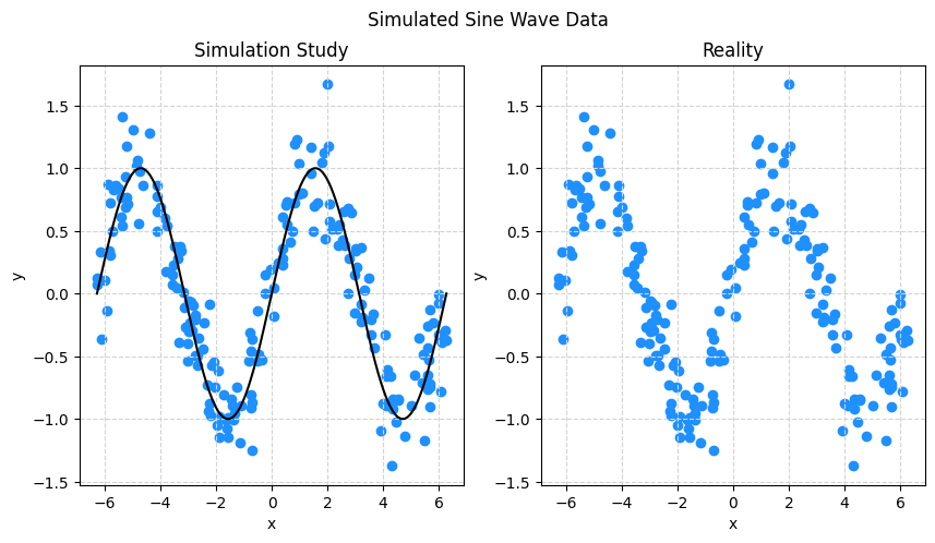
knn100 = KNeighborsRegressor(n_neighbors=100)
knn010 = KNeighborsRegressor(n_neighbors=10)
knn001 = KNeighborsRegressor(n_neighbors=1)
knn100.fit(X, y)
knn010.fit(X, y)
knn001.fit(X, y)KNeighborsRegressor(n_neighbors=1)In a Jupyter environment, please rerun this cell to show the HTML representation or trust the notebook.
On GitHub, the HTML representation is unable to render, please try loading this page with nbviewer.org.
KNeighborsRegressor(n_neighbors=1)
# setup figure
fig, (ax1, ax2, ax3) = plt.subplots(1, 3)
fig.set_size_inches(15, 5)
fig.set_dpi(100)

# add overall title
fig.suptitle('Simulated Sine Wave Data')

# x values to make predictions at for plotting purposes
x_plot = np.linspace(-2*np.pi, 2*np.pi, 1000).reshape((1000, 1))

# create subplot for "simulation study"
ax1.set_title("KNN, k = 100")
ax1.scatter(X, y, color="dodgerblue")
ax1.set_xlabel("x")
ax1.set_ylabel("y")
ax1.grid(True, linestyle='--', color='lightgrey')
ax1.plot(x_plot, np.sin(x_plot), color='black')
ax1.plot(x_plot, knn100.predict(x_plot), color='red')

# create subplot for "reality"
ax2.set_title("KNN, k = 10")
ax2.scatter(X, y, color="dodgerblue")
ax2.set_xlabel("x")
ax2.set_ylabel("y")
ax2.grid(True, linestyle='--', color='lightgrey')
ax2.plot(x_plot, np.sin(x_plot), color='black')
ax2.plot(x_plot, knn010.predict(x_plot), color='red')

# create subplot for "reality"
ax3.set_title("KNN, k = 1")
ax3.scatter(X, y, color="dodgerblue")
ax3.set_xlabel("x")
ax3.set_ylabel("y")
ax3.grid(True, linestyle='--', color='lightgrey')
ax3.plot(x_plot, np.sin(x_plot), color='black')
ax3.plot(x_plot, knn001.predict(x_plot), color='red')

# show plot
plt.show()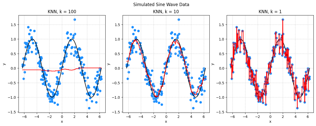
dt01 = DecisionTreeRegressor(max_depth=1)
dt05 = DecisionTreeRegressor(max_depth=5)
dt10 = DecisionTreeRegressor(max_depth=10)
dt01.fit(X, y)
dt05.fit(X, y)
dt10.fit(X, y)DecisionTreeRegressor(max_depth=10)In a Jupyter environment, please rerun this cell to show the HTML representation or trust the notebook.
On GitHub, the HTML representation is unable to render, please try loading this page with nbviewer.org.
DecisionTreeRegressor(max_depth=10)
# setup figure
fig, (ax1, ax2, ax3) = plt.subplots(1, 3)
fig.set_size_inches(15, 5)
fig.set_dpi(100)

# add overall title
fig.suptitle('Simulated Sine Wave Data')

# x values to make predictions at for plotting purposes
x_plot = np.linspace(-2*np.pi, 2*np.pi, 1000).reshape((1000, 1))

# create subplot for "simulation study"
ax1.set_title("DT, max_depth = 1")
ax1.scatter(X, y, color="dodgerblue")
ax1.set_xlabel("x")
ax1.set_ylabel("y")
ax1.grid(True, linestyle='--', color='lightgrey')
ax1.plot(x_plot, np.sin(x_plot), color='black')
ax1.plot(x_plot, dt01.predict(x_plot), color='red')

# create subplot for "reality"
ax2.set_title("DT, max_depth = 05")
ax2.scatter(X, y, color="dodgerblue")
ax2.set_xlabel("x")
ax2.set_ylabel("y")
ax2.grid(True, linestyle='--', color='lightgrey')
ax2.plot(x_plot, np.sin(x_plot), color='black')
ax2.plot(x_plot, dt05.predict(x_plot), color='red')

# create subplot for "reality"
ax3.set_title("DT, max_depth = 10")
ax3.scatter(X, y, color="dodgerblue")
ax3.set_xlabel("x")
ax3.set_ylabel("y")
ax3.grid(True, linestyle='--', color='lightgrey')
ax3.plot(x_plot, np.sin(x_plot), color='black')
ax3.plot(x_plot, dt10.predict(x_plot), color='red')

# show plot
plt.show()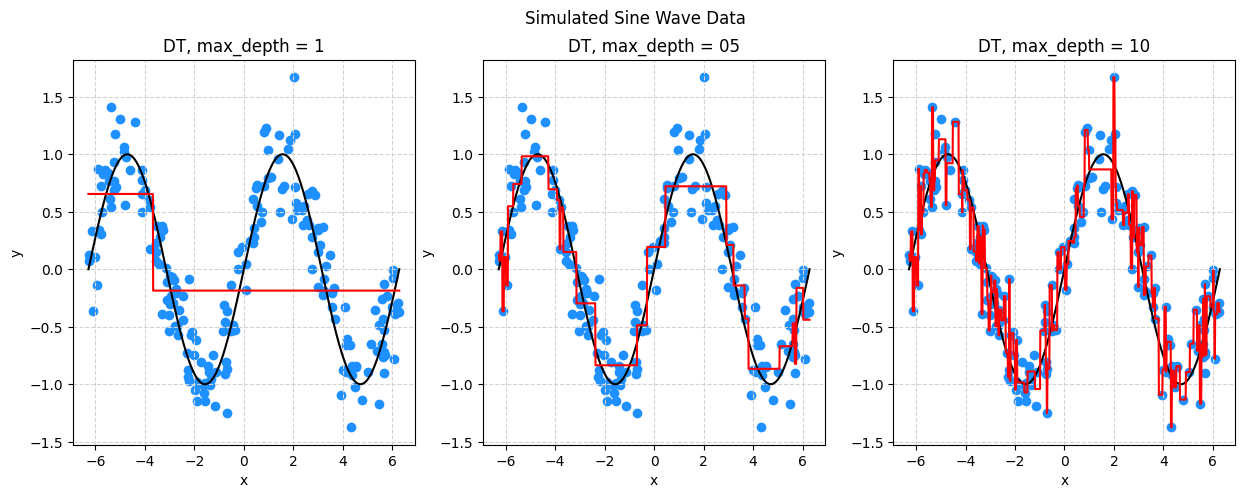
# train RMSE goes down as flexibility goes up
print(np.sqrt(np.mean(((dt01.predict(X)).reshape(200, 1) - y) ** 2)))
print(np.sqrt(np.mean(((dt05.predict(X)).reshape(200, 1) - y) ** 2)))
print(np.sqrt(np.mean(((dt10.predict(X)).reshape(200, 1) - y) ** 2)))
0.5922964673600705
0.2321060292671149
0.06085014708879982